Cloud House
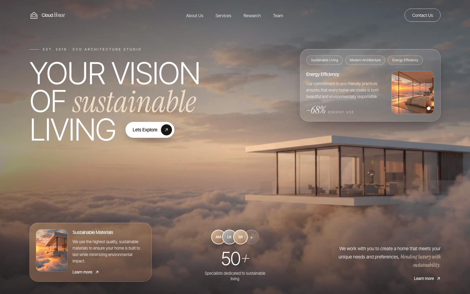
An eco architecture studio hero with a cloudscape video and frosted glass cards.
What moves
- Cloudscape video looping behind everything
- Each block rising in out of a blur, one after another
- A pulsing ring on the feature card photo
From prompt to live site
- Make the visualsGenerate the image, then animate it into a seamless looping clip. Both prompts are below.
- Copy the promptOne click. Fill in anything in [square brackets] with your own details.
- Paste it into your builderClaude, Lovable, Cursor, v0. Upload your frames to the public/frames folder if it uses them.
- LaunchSwap the copy for yours, check it on your phone, publish.
Asset prompts
Product image
For any image modelCreate a landscape 16:9 image (as wide as possible, e.g. 1792x1024). Ultra-photorealistic surreal architectural visualization. A serene modern eco home with warm timber, stone and floor-to-ceiling glass, resting on a soft bank of clouds high above the world at golden hour. An endless sea of warm peach and cream clouds stretches to the horizon. Soft sunlight, gentle haze, calm luxurious mood. Composition: the house sits slightly right of centre and low in the frame. The left half and the top are calm sky and clouds with plenty of empty space for website text. Eye-level wide shot, 24mm lens, cinematic, award-winning architectural photography. No text, no logos, no people, no website UI, no borders.
Video clip
Image-to-video, using the image aboveAnimate this image into a subtle, photorealistic, cinematic loop. The clouds drift slowly and roll softly around the house, light haze moves through the scene, the sunlight shifts very gently. The house stays perfectly still and solid with no warping. Very slow, almost unnoticeable push-in. Seamless 6 to 8 second infinite loop, no cuts, no new objects, no people, no text, 16:9.
Build a full-screen hero section for "Cloud House", an eco-conscious architecture studio. Match every detail below exactly: colours, sizes, copy and timings.

MEDIA (use these exact URLs)
- Background video: https://res.cloudinary.com/dnkrqpuqk/video/upload/v1791138851/watermark-removed-video_qvhyst.mp4
- Bedroom photo (feature card): https://res.cloudinary.com/dnkrqpuqk/image/upload/v1791139344/Golden-Hour_Cloudscape_Bedroom_yyluqd.png
- Floating house photo (materials card): https://res.cloudinary.com/dnkrqpuqk/image/upload/v1791139380/Dream_House_Above_the_Clouds_juexty.png
If you use Next.js <Image>, allow the host res.cloudinary.com in the image config.

STACK
- Next.js (App Router) + TypeScript + Tailwind CSS. If your tool uses React + Vite, build the same thing there.
- Fonts from Google Fonts: "Inter Tight" for everything and "Instrument Serif" (400, normal and italic) for accent words.
- Page background #14110f, text #f5f1ea. Accent peach #f1dcc4.

GLASS STYLES
- .glass: background linear-gradient(135deg, rgba(255,255,255,0.16), rgba(255,255,255,0.06)); border 1px solid rgba(255,255,255,0.22); backdrop-filter blur(18px) saturate(140%); box-shadow inset 0 1px 0 rgba(255,255,255,0.25), 0 20px 50px -20px rgba(0,0,0,0.45).
- .glass-warm: background linear-gradient(150deg, rgba(176,132,98,0.62), rgba(120,86,62,0.42)); border 1px solid rgba(255,236,214,0.22); backdrop-filter blur(16px) saturate(130%); box-shadow inset 0 1px 0 rgba(255,255,255,0.18), 0 20px 50px -20px rgba(0,0,0,0.5).

HERO (section, min-height 100svh, full width, overflow hidden, background #1a1714 while the video loads, white text)
- The video covers the whole section: autoplay, muted, loop, playsInline, preload auto, object-fit cover, behind everything.
- Two overlays: a top-to-bottom gradient black 45% to black 5% to black 55%, and a left-to-right gradient black 35% to transparent.
- Content wrapper: max-width 1440px, centred, padding 20px sides on mobile, 32px from 640px, 48px from 1024px; top padding 112px (144px on large screens), bottom 24px (40px on large). A flex column so the bottom row sits at the bottom.

NAVBAR (absolute on top of the hero, same max-width and side padding, 20px vertical padding, 28px on large)
- Logo: a 30px outline icon of a house (stroke 1.6) with a small cloud inside (stroke 1.4), then "Cloud" in Inter Tight 15px medium and " House" in Instrument Serif italic 18px.
- Centre links (hidden on mobile, gap 40px): About Us, Services, Research, Team. 14px, white at 85%, full white on hover, with a 1px white underline that grows from 0 to full width on hover (300ms).
- Right: an outlined pill "Contact Us" (1px white border at 70%, padding 10px 24px, 14px) that fills white with dark text on hover.
- On mobile: a 44px round .glass button with two lines that turn into an X, opening a .glass dropdown (radius 24px) with all links plus Contact Us.

TOP ROW (headline on the left, feature card on the right; stacked on mobile, gap 40px)
- Kicker: a 32px white line at 60%, then "Est. 2016 · Eco Architecture Studio", 11px, medium, uppercase, letter-spacing 0.32em, white at 75%, 24px below.
- Headline (max-width 760px): font-size clamp(2.6rem, 7vw, 6.2rem), font-weight 300, uppercase, line-height 0.92, letter-spacing -0.035em. Three lines: "Your vision" / "of sustainable" / "Living". "sustainable" is Instrument Serif italic, normal case, letter-spacing -0.01em, colour #f1dcc4.
- On the same line as "Living" (gap 24px, 32px on larger screens): a white pill button "Lets Explore" (14-15px medium, normal case, padding 8px 8px 8px 24px, soft shadow) with a 36px dark circle holding an up-right arrow. On hover the pill turns #f1dcc4 and the circle rotates 45° (500ms).
- Feature card (.glass, max-width 460px, radius 28px, padding 16-20px): three chips (Sustainable Living, Modern Architecture, Energy Efficiency) with a white 35% border, faint white fill, 11.5px text. Below, a row: left, "Energy Efficiency" (15px medium), the paragraph "Our commitment to eco-friendly practices ensures that every home we create is both beautiful and environmentally responsible." (13px, white 75%), then "-68%" in Instrument Serif italic 34px next to "ENERGY USE" (11px, letter-spacing 0.2em, white 60%). Right, the bedroom photo as a square 120px (140px from 640px), radius 16px, white 25% border, zooming to 105% on hover (700ms), with a 10px white dot in its bottom-right corner that sends out a pulsing ring (scale 1 to 2.4, fading out, every 2.2s).

BOTTOM ROW (3 columns from 768px, items aligned to the bottom, gap 20px / 32px, at least 64px below the top row)
1. Materials card (.glass-warm, max-width 400px, radius 28px, padding 16-20px): the floating house photo (104px wide, 3:4, radius 16px, zoom on hover), then "Sustainable Materials" (15px medium), "We use the highest quality, sustainable materials to ensure your home is built to last while minimizing environmental impact." (13px, white 85%), and a "Learn more ↗" link.
2. Centre: three overlapping 48px avatars (2px white border) with initials on gradients: AM (#d9b99b to #8a6347), LK (#c7c2b8 to #6b665e), SR (#e2c6a6 to #9c7552), plus a .glass "+" circle. Below, "50+" at clamp(2.6rem, 4.5vw, 3.75rem), weight 300, letter-spacing -0.04em, with the "+" in italic serif peach. Then "Specialists dedicated to sustainable living" (13px, white 80%, max 200px).
3. Right aligned: "We work with you to create a home that meets your unique needs and preferences, blending luxury with sustainability." (15px, white 90%, max 340px) with "blending luxury with sustainability." in Instrument Serif italic 17px peach, then a "Learn more ↗" link.
"Learn more" links: 13px medium white, an underline that grows from the left on hover, and the arrow moving up-right 2px.

MOTION
- Every block rises in on load: from 24px lower, opacity 0 and blur 6px, to its place over 1.1s with cubic-bezier(0.22, 1, 0.36, 1). Delays: nav 0.1s, kicker 0.2s, headline 0.3s, feature card 0.55s, materials card 0.8s, specialists 0.95s, closing text 1.1s.
- Respect prefers-reduced-motion: show everything at once, no rising and no pulsing ring.

Fully responsive with no horizontal scroll. Page title "Cloud House — Sustainable Living, Designed", theme colour #1a1714.